Warning: preg_replace(): Compilation failed: invalid range in character class at offset 4 in /nas/content/live/auz1111/wp-content/plugins/crayon-syntax-highlighter/crayon_langs.class.php on line 340
HTML5 – PLANET AUZ

HTML5 Video with Video.js

HTML has been the language of the web for over almost 20 years with the first standard being accepted in November of 1995.  Many of us have been using the language even longer and throwing around <img> , <a>, and <p> tags are second nature.  In the past it has always been hard to integrate video on the web without the use of plugins.  At some point most of us have all been prompted to download the latest version of Flash, or update Quicktime to enjoy a video clip.  With the latest HTML specification there is now a <video> tag that allows for native playback of video in the browser.  This addition will allow for better playback performance, and will open up new and exciting ways of interacting with video on a web page.

What is VideoJS?

VideoJS is a JavaScript API for accessing the HTML5 media library.  There are many HTML5 video players now online, and many more are popping up every day.  I chose to work with VideoJS for now, because it was the easiest for me to understand, and I really didn’t feel like experimenting with any others at the moment, although Popcorn.js is looking pretty “butter”! Using the VideoJS API also adds some functionality to the player that some browsers have not implemented such as fullscreen, subtitles, and it also provides a consistent JavaScript API for HTML5 and Flash.  Another great benefit of VideoJS is that it is open-source and CDN hosted.

 An Example

I began researching HTML5 players when my homie, Spencer,  at Umami Media filled me in on a project he was working on for a client that is ready to start experimenting with HTML5 video.  We were both interested in the control and functionality of the player.  More specifically, we wanted to know if the playhead could be moved, or if we could pull meta information out of the video to be used in scripting.  I decided to work on a small demo that night, and was able to rapidly put together a quick demo.  VideoJS makes it easy to access most of the functionality we were looking, and with some custom JavaScript and jQuery you can do some pretty amazing things.  Please click the link below to open up the demo and “play” around.  The demo shows how  information such as duration, play time, play head location, volume, and dimensions can be pulled from the player and displayed within the HTML.  All of the players controls have also been built in HTML, and can be used anywhere on the page.  Make sure to click the “Switch Source” button to see the video changed and play on auto.  If you wait for 8 seconds on the second video (The Google Vid), you can see how I used some jQuery to animate certain parts of the player at specific times in the video.  WOW!  That was really cool, and fun to play with.  Let the video play until the end and you will see an HTML <div> pop up letting you know the video has ended.

Click for Demo

Conclusion

It is easy to see why HTML5 video will play an important role in the future of the web from just this simple demo.  There are currently being applications built with the spec that allow for some truly amazing interaction.  Check out this Sketchpad Walkthrough built with another HTML5 JavaScript API called Popcorn.js.  The demo shows how the player can manipulate the HTML and generate a code walkthrough that is in sync with the media.  DOPE!

Keep your eyes open, because we are going to see an explosion of this type of video interactions in the coming years.  HTML5 may not be standard quite yet, but that shouldn’t stop us from playing with and pushing this technology forward.  I am definitely looking forward to the future of the web, and technologies like this will surely sharpen that vision.


More Birthdays, Bill Cosby, Beer, and 2.5D w/ ImpactJS

In the past past few weeks I really have not done much with the ImpactJS demo I have been working on. There are some minor updates to the collision layers, collision boxes, and graphics, but not much functionality has been added. I’m currently working on developing a Game Design Document (GDD) for an original game so I don’t see much more time being spent on this demo/test. Most of the updates I made have been summarized in this thread. I didn’t get a chance to upload the most recent version last time so here it is. Keep in mind that there are lots of bugs, and Ramona is the least buggy character to play with.

Click here to PLAY!


Moving on…

Over the past two months I have felt an enormous amount of excitement for HTML5 game development and the idea that some of today’s most popular computer games will one day be run in the browser using the tools that built the web.  I constantly run into professionals that are ready for true multi-platform development.  There is so much to look forward to for “web development”.  Will web developers still be “web developers” when the term encompasses so much more?  Sounds fun to me!

1st Bday #inBend

At this very moment last year I was visiting my brother and his family in Atlanta.  I was over joyed to be with my family, but the timing was just a little off.  Actually, Jenna and Nate would say it was right on time, and it is hard to beat a bday with the number “11”x2 in it!  Fortu”Nate”ley, I was able to spend this year with the fam as we celebrated Marlo’s first Birthday!  There is nothing like a first bday, and Marlo’s was no exception.  Friends and family showed up from all over with an appetite for Nate’s superb

The Billsons
My Little Pudding Pop!

brunch, and maybe a few beers!  Marlo kept us all entertained because she is pretty much the cutest thing you have ever seen on this earth.  Can’t wait until birthday number two!  It’s just bday number 18 I’m worried about… I guess Nate will have had plenty of target practice with the shotgun by then!

The Cos

If you have the opportunity to take your family to see Bill Cosby while he is still touring I would highly suggest it.  We had a chance to see Bill last Sunday at the Hooker Creek Event Center in Redmond, OR.  I  expected Bill’s performance to be similar to what we have come to expect from him, but maybe a little slower.  He is after all, much older than his days of bouncing Rudy and Bud around on one knee.  It was Bill’s perception and values that gave me hope for breaking the stereotypical african-american family portrayed in the media.  I stereotype that even today is often placed on TV because of the ratings dramatic character development often brings.  Anyway, I expected him to be humorous, but not “as” humorous.  In reality, it may have just been the fact that this was somebody I looked upon as a role model when I was younger. I’m just happy I finally was able to experience him LIVE in Bend, Oregon.  That… plus the fact that it was in Bend, Oregon… a place where even a black man can relate.  One thing is for sure… we all know how to laugh… and that’s exactly what we did.


Project Management w/ Do.com

Near the beginning of 2012 we switched our business’ project management over to Basecamp.  Previously, I used Basecamp, and was impressed with their system from past projects.  My last experience with Basecamp was around 2008 so I expected major improvements, and was eager to get our company and our partner company on board.  When you embrace a new system into your business it always takes time to train employees, and also yourself.  I had a great feeling about Basecamp, and as a result I didn’t do much research on other project management systems.  We needed something simple, and clean.  We have a small bunch that is some what technically savvy, but some have trouble finding the reply button for emails.  I thought Basecamp would be simple and flexible enough for all of us to integrate.

How Basecamp FAILED!

We have been using Basecamp for about 6 months now, and I have just been getting this bad feeling about it from day one.  Well, when we sign up for the service the interface had COMPLETELY changed from the system I used in 2008.  I knew they had new system, and were not letting people sign up for the old version so I took this as improvement, but quickly found the opposite.

The portfolio view is pretty to look at, but not very functional.  If you have tons of companies that you are working with then you are constantly scrolling down the screen to find them.  So, I changed the view to the “list” option and this view lacked the feel I was hoping for as well.  You lose the  images of who is connected to the project, and it’s almost too simple!  Then I changed to the featured/list view, but I wouldn’t use this view because my featured project changes daily or weekly.  It would be work just to maintain this view.

I didn’t let this small issue stop us, though.  We continued to use the system, and found that it worked well.  Then I began noticing small things that should be possible were NOT!  Didn’t the old version have project templates?  Apparently, this version does not.  That seems like a downgrade to me…I thought this was the new system!?! Oh, I can’t email in tasks? Hey, how do I duplicate a task? NOT possible!  Can I filter or sort this task list? NOT Possible! Wait, isn’t this kind of functionality expected these days?  And are we not paying a monthly for this?!?!

So, I began to run into a lot of little things that can add up to a lot of missed productivity.  It was time to find something else.

Edit:  you can now email in tasks to Basecamp.

What is Do.com?

A few days ago I started researching project management apps, and came across a looooooong list of clones, and other products/services.  The only one I felt was similar to Basecamp, yet more advanced was Do.com.  Do.com is a web application with collaborative task/TODO lists focused on projects and tasks.  I actually ran into Do.com while searching the Google Apps Marketplace.  Google Apps is the backbone of our email, and document sharing so I wanted something that would connect.  Do.com is developed by Salesforce, and has been making some waves in collaborative task management.

What it Do.com Better

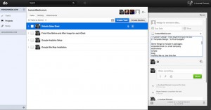
Do.com allows you to sign in with your Google Apps account from the start!  This means it saves me time training employees how to login and remember passwords for yet another web application.  They can just type in their current email address and password and start using the system.  The interface is clean, but also offers much more depth than Basecamp.  You can keep all the tasks on the screen when drilling down to a single tasks.  This makes moving between tasks much more efficient.   There is the ability to create project templates, which will save us a lot of time, and help us refine our processes.  You can email in task by sending emails to task@do.com. So simple!  Oh, and look at that! It is possible to filter tasks, and you can even create sections for organizing tasks!  Another awesome feature is the ability to attach Google Docs from your Google Drive.  That alone was almost enough to sell me.  Do.com also has an open API for developers.  Sometimes, a task requires documentation, and I do all of mine in Google Docs.  I was amazed and for the low price of FREE (there will be a premium version later), I started moving all of our projects over to do.com.  I knew the team would love learning a new system just after getting to grips with Basecamp, but it would be worth it in more ways than one.

Conclusion

When I researched project management systems/ TODO List I also came across Asana which was created by some former Facebook developers. Wow! This system looks great too! It is pretty much Do.com (or vice versa), but with a few additional features.  I noticed that you can add tags to tasks, which adds even more sorting, filtering possibilites. Asana also makes it apparent they have lots of shortcuts which are conveniently placed at the bottom of the screen.  Hmmmmm… I think we will stick with Do.com because it looks cleaner/simpler, and the Google Apps integration is better.

My only complaints about Do.com at this point is the small view for task/TODO comments, and the lack of an option to edit the comment.  The tasks view in general should be given an option to expand and give you more formatting controls ie the task detail page for Basecamp.  The option to track the time spent on a task would be nice so that we could import that data into Freshbooks.  Also, the lack of tags for tasks could be “easily” fixed.   I will be paying close attention to Asana, and other cloud hosted project management apps that emerge.  Another one I have on the radar is Teamlab. For now I am sticking with Do.com, and it looks like our company will too!

August 15, 2012 EDIT: Do.com made some changes to the interface yesterday.  It looks better, but I don’t see much functionality change.  I sent a feedback message to their team stating I would like to see templates for task list.  This would allow you to add a list of tasks to an already existing project.

Links: