Near the beginning of 2012 we switched our business’ project management over to Basecamp. Previously, I used Basecamp, and was impressed with their system from past projects. My last experience with Basecamp was around 2008 so I expected major improvements, and was eager to get our company and our partner company on board. When you embrace a new system into your business it always takes time to train employees, and also yourself. I had a great feeling about Basecamp, and as a result I didn’t do much research on other project management systems. We needed something simple, and clean. We have a small bunch that is some what technically savvy, but some have trouble finding the reply button for emails. I thought Basecamp would be simple and flexible enough for all of us to integrate.
How Basecamp FAILED!
We have been using Basecamp for about 6 months now, and I have just been getting this bad feeling about it from day one. Well, when we sign up for the service the interface had COMPLETELY changed from the system I used in 2008. I knew they had new system, and were not letting people sign up for the old version so I took this as improvement, but quickly found the opposite.
The portfolio view is pretty to look at, but not very functional. If you have tons of companies that you are working with then you are constantly scrolling down the screen to find them. So, I changed the view to the “list” option and this view lacked the feel I was hoping for as well. You lose the  images of who is connected to the project, and it’s almost too simple! Then I changed to the featured/list view, but I wouldn’t use this view because my featured project changes daily or weekly. It would be work just to maintain this view.
I didn’t let this small issue stop us, though. We continued to use the system, and found that it worked well. Then I began noticing small things that should be possible were NOT! Didn’t the old version have project templates? Apparently, this version does not. That seems like a downgrade to me…I thought this was the new system!?! Oh, I can’t email in tasks? Hey, how do I duplicate a task? NOT possible! Can I filter or sort this task list? NOT Possible! Wait, isn’t this kind of functionality expected these days? And are we not paying a monthly for this?!?!
So, I began to run into a lot of little things that can add up to a lot of missed productivity. It was time to find something else.
Edit: you can now email in tasks to Basecamp.
What is Do.com?
A few days ago I started researching project management apps, and came across a looooooong list of clones, and other products/services. The only one I felt was similar to Basecamp, yet more advanced was Do.com. Do.com is a web application with collaborative task/TODO lists focused on projects and tasks. I actually ran into Do.com while searching the Google Apps Marketplace. Google Apps is the backbone of our email, and document sharing so I wanted something that would connect. Do.com is developed by Salesforce, and has been making some waves in collaborative task management.
What it Do.com Better
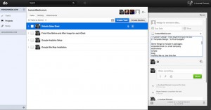
Do.com allows you to sign in with your Google Apps account from the start! This means it saves me time training employees how to login and remember passwords for yet another web application. They can just type in their current email address and password and start using the system. The interface is clean, but also offers much more depth than Basecamp. You can keep all the tasks on the screen when drilling down to a single tasks. This makes moving between tasks much more efficient. There is the ability to create project templates, which will save us a lot of time, and help us refine our processes. You can email in task by sending emails to task@do.com. So simple! Oh, and look at that! It is possible to filter tasks, and you can even create sections for organizing tasks! Another awesome feature is the ability to attach Google Docs from your Google Drive. That alone was almost enough to sell me. Do.com also has an open API for developers. Sometimes, a task requires documentation, and I do all of mine in Google Docs. I was amazed and for the low price of FREE (there will be a premium version later), I started moving all of our projects over to do.com. I knew the team would love learning a new system just after getting to grips with Basecamp, but it would be worth it in more ways than one.
Conclusion
When I researched project management systems/ TODO List I also came across Asana which was created by some former Facebook developers. Wow! This system looks great too! It is pretty much Do.com (or vice versa), but with a few additional features. I noticed that you can add tags to tasks, which adds even more sorting, filtering possibilites. Asana also makes it apparent they have lots of shortcuts which are conveniently placed at the bottom of the screen. Hmmmmm… I think we will stick with Do.com because it looks cleaner/simpler, and the Google Apps integration is better.
My only complaints about Do.com at this point is the small view for task/TODO comments, and the lack of an option to edit the comment. The tasks view in general should be given an option to expand and give you more formatting controls ie the task detail page for Basecamp. The option to track the time spent on a task would be nice so that we could import that data into Freshbooks. Also, the lack of tags for tasks could be “easily” fixed. I will be paying close attention to Asana, and other cloud hosted project management apps that emerge. Another one I have on the radar is Teamlab. For now I am sticking with Do.com, and it looks like our company will too!
August 15, 2012 EDIT: Do.com made some changes to the interface yesterday. It looks better, but I don’t see much functionality change. I sent a feedback message to their team stating I would like to see templates for task list. This would allow you to add a list of tasks to an already existing project.
Links:


